- Forums
- Graphics & Programming
- GFX Discussion, Tutorials and Requests.
- Like mine sigs...
You are using an out of date browser. It may not display this or other websites correctly.
You should upgrade or use an alternative browser.
You should upgrade or use an alternative browser.
Like mine sigs...
- Thread starter Davidman215
- Start date


Davidman215
FS Member
Lol i had the same thing in my clan, graphics designer...

Davidman215
FS Member
Code of conduct , pretty super homo it's re new on the 9th of this month...
Davidman215
FS Member
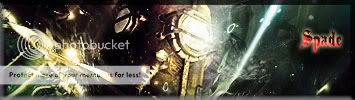
These are very old sigs of mine 8 or 7 months old im going to make more l8ter.... These are not fake i made these, for all u haters out there.
Davidman215
FS Member
Here some more i found on my photobucket account
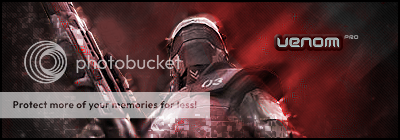
Made this one for my Clan leader

I had alot of names Venom,Hostel,Davidman215,Spade#Venom


My Favorite


Made this one for my Clan leader
I had alot of names Venom,Hostel,Davidman215,Spade#Venom
My Favorite
Davidman215
FS Member
Need to download photoshop Cs2 then hehe 

Davidman215
FS Member
Like my sigs...
Sorry i was in a rush...
Sorry i was in a rush...
Reflector
Full Member
They are nice. Good to see someone else enjoys photoshop ") . I do have some advice and/or suggestions for your signatures. The text. Personally, if I were to see some of those sigs and you said you made them. I'd say "The signature itself is great, however, I find the text very "out of place" in which case it looks like you've just grabbed a pre-existing template and slapped your own text on there." (Not saying that's what you have done
. I do have some advice and/or suggestions for your signatures. The text. Personally, if I were to see some of those sigs and you said you made them. I'd say "The signature itself is great, however, I find the text very "out of place" in which case it looks like you've just grabbed a pre-existing template and slapped your own text on there." (Not saying that's what you have done ") ) But yeah, I had the same problem when I stated. VERY bad text choice . So a suggestion, work on your text and you'll be set
) But yeah, I had the same problem when I stated. VERY bad text choice . So a suggestion, work on your text and you'll be set
. I do have some advice and/or suggestions for your signatures. The text. Personally, if I were to see some of those sigs and you said you made them. I'd say "The signature itself is great, however, I find the text very "out of place" in which case it looks like you've just grabbed a pre-existing template and slapped your own text on there." (Not saying that's what you have done ) But yeah, I had the same problem when I stated. VERY bad text choice . So a suggestion, work on your text and you'll be set Davidman215
FS Member
Totally right... thanks for the help.... by the way this was an old sig........
TwistedFate
Respected
goddamn the zicker one is really nice
W
WorldWarIII
Guest
Not too bad of work, keep it up!
Davidman215
FS Member
yeah i'm down with that... 
mbsurfer
FS Member
Colors: Bright and sunny
Theme: Surfing/Sunny
Render: Planet Renders // Renders - Sports Renders/Josh Kerr
Name: mbsurfer
Seeing by your artistic abilities, I'm sure you can come up with something amazing
Thank you so much!
Theme: Surfing/Sunny
Render: Planet Renders // Renders - Sports Renders/Josh Kerr
Name: mbsurfer
Seeing by your artistic abilities, I'm sure you can come up with something amazing
Thank you so much!
Davidman215
FS Member
Is this okay....

Hope you like it.....
Hope you like it.....
mbsurfer
FS Member
I LOVE it, except I don't understand where the C is coming from haha. If it's an easy fix, could you please take Josh Kerr and the C out, just to leave my name. If it's too much of a hassle don't worry about it. It looks great though! Thank you so much!Is this okay....
Hope you like
it.....
Davidman215
FS Member
Sure
Davidman215
FS Member
Here you go made some changes but still looks the same...

As my Choice i would choose the first one because it looks better...
As my Choice i would choose the first one because it looks better...
mbsurfer
FS Member
Here you go made some changes but still looks the same...
As my Choice i would choose the first one because it looks better...
It's almost like my name is hidden
Nah, just playing, that shit is tight!!!
Davidman215
FS Member
Glad u like it.......
Trigger-happy
FS Member
wow nice renders! where did you get your background image form?
Davidman215
FS Member
PremiumRenders,planetrenders more and more...
Similar threads
- Replies
- 0
- Views
- 126
- Replies
- 0
- Views
- 233
- Forums
- Graphics & Programming
- GFX Discussion, Tutorials and Requests.
- Like mine sigs...